


Types Of Color Palettes For Interior Explained
Understanding the types of color palettes used in interior design is essential for creating balanced, visually appealing homes. Whether you’re updating a single room or planning a full renovation, color theory plays a major role in how a space feels and functions. Different palette systems, such as monochromatic color schemes, complementary pairings, and triadic combinations, help designers organize color in a structured way. These systems are not just artistic concepts; they directly influence mood, perception of space, and overall design harmony. In modern US homes, especially open-concept layouts, choosing the right modern interior palettes can improve flow between rooms and enhance natural light. Paint brands like Sherwin-Williams and Benjamin Moore often build collections around these foundational color systems to simplify decision-making for homeowners. This guide breaks down each major palette type and explains how to apply interior color theory in real home environments, not just in design textbooks.
What Are types of Color Palettes in Interior Design?
In interior design, types of color palettes refer to structured combinations of colors used to create harmony, contrast, and visual balance within a space. Rather than choosing colors randomly, designers rely on interior color theory to build intentional schemes that guide how a room feels and functions. A color palette typically includes a dominant color, secondary tones, and accent shades that work together across walls, furniture, and décor. These home color combinations help ensure that a space feels cohesive rather than fragmented or visually chaotic.
Modern design approaches often use palette systems to simplify decision-making, especially in US homes with open layouts where multiple rooms flow into one another. By following established frameworks like monochromatic, complementary, or analogous schemes, homeowners can achieve consistent styling throughout the home. Understanding these foundational principles makes it easier to select paint colors, furniture finishes, and decorative elements that support a unified interior design vision.
Monochromatic Color Scheme Explained
A monochromatic color scheme is one of the simplest and most cohesive types of color palettes, built entirely from variations of a single hue. Instead of mixing multiple colors, this approach uses different shades, tints, and tones of one base color to create depth and visual interest. In interior design, this system is often used to achieve a clean, unified look. For example, a room might feature soft gray walls, charcoal furniture, and light gray accents, all belonging to the same color family. This creates a subtle, layered effect without introducing visual conflict.
Monochromatic palettes are especially popular in modern interior palettes because they support minimalism and make spaces feel calm and organized. They also work well in small rooms, where limiting color variation helps reduce visual clutter and enhances spaciousness. When applied correctly, this approach creates a sophisticated and timeless interior that feels intentional rather than repetitive or flat.
Complementary Colors in Home Design
Complementary colors are one of the most dynamic types of color palettes, built by pairing colors that sit opposite each other on the color wheel. Common examples include blue and orange, red and green, or yellow and purple. In interior design, this pairing creates strong contrast and visual energy. When used in home spaces, complementary schemes are often balanced carefully to avoid overwhelming the room. Typically, one color acts as the dominant base while the other is used as an accent through furniture, artwork, or décor. This approach helps maintain harmony while still introducing bold visual interest.
In modern interiors, designers often tone down complementary combinations by using muted or desaturated versions of each hue. This makes the palette more livable for everyday spaces like living rooms or home offices. As part of interior color theory, complementary schemes are especially effective for creating focal points and adding depth to otherwise simple home color combinations.
Analogous Color Palette and How It Works
An analogous color palette is one of the most harmonious types of color palettes, created by combining colors that sit next to each other on the color wheel. Common examples include blue, blue-green, and green, or red, red-orange, and orange. Because these hues share similar undertones, they naturally blend together without strong contrast. In interior design, this approach is often used to create smooth, visually comfortable spaces. Unlike more dramatic schemes, an analogous palette produces a gentle flow of color that feels cohesive and balanced. This makes it especially popular in bedrooms, living rooms, and open-concept areas where continuity is important.
Designers often introduce subtle variation in value and saturation to prevent the palette from feeling flat. For example, a soft sage wall might be paired with deeper green accents and muted blue textiles. As part of interior color theory, analogous schemes are ideal for creating calm, unified home color combinations that feel natural and easy on the eye.
Triadic Color Scheme for Balanced Interiors
A triadic color scheme is one of the more structured types of color palettes, formed by selecting three colors that are evenly spaced around the color wheel. Common examples include combinations like red, blue, and yellow, or more modern variations such as teal, coral, and mustard. In interior design, triadic schemes are used to create balance while still allowing for variety and visual interest. Unlike complementary palettes, which rely on high contrast between two colors, triadic combinations distribute color more evenly throughout a space, making them feel more dynamic but still controlled.
Designers often choose one dominant color and use the other two as supporting accents to avoid overwhelming the room. This approach is especially effective in modern interior palettes, where bold expression is balanced with structure and cohesion. When applied thoughtfully, triadic systems can enhance home color combinations by adding depth, personality, and a sense of intentional design without sacrificing harmony.
How to Choose the Right Interior Color Palette
Selecting from the different types of color palettes depends on your home’s lighting, layout, and the mood you want to create. Instead of choosing colors in isolation, designers use interior color theory to match palette structure with real-life function and space conditions. For example, homes with limited natural light often benefit from lighter modern interior palettes, such as monochromatic or analogous schemes, which help maintain brightness and visual continuity. In contrast, larger or more open spaces can handle stronger contrast, making complementary or triadic home color combinations more effective.
It’s also important to consider how the space will be used. Calm environments like bedrooms often work best with soft, low-contrast palettes, while social areas like living rooms can support more dynamic color interactions. Ultimately, choosing the right palette is about balancing personal style with practical design principles, ensuring the colors work together across furniture, flooring, and architectural features.
Modern Interior Palettes for US Homes
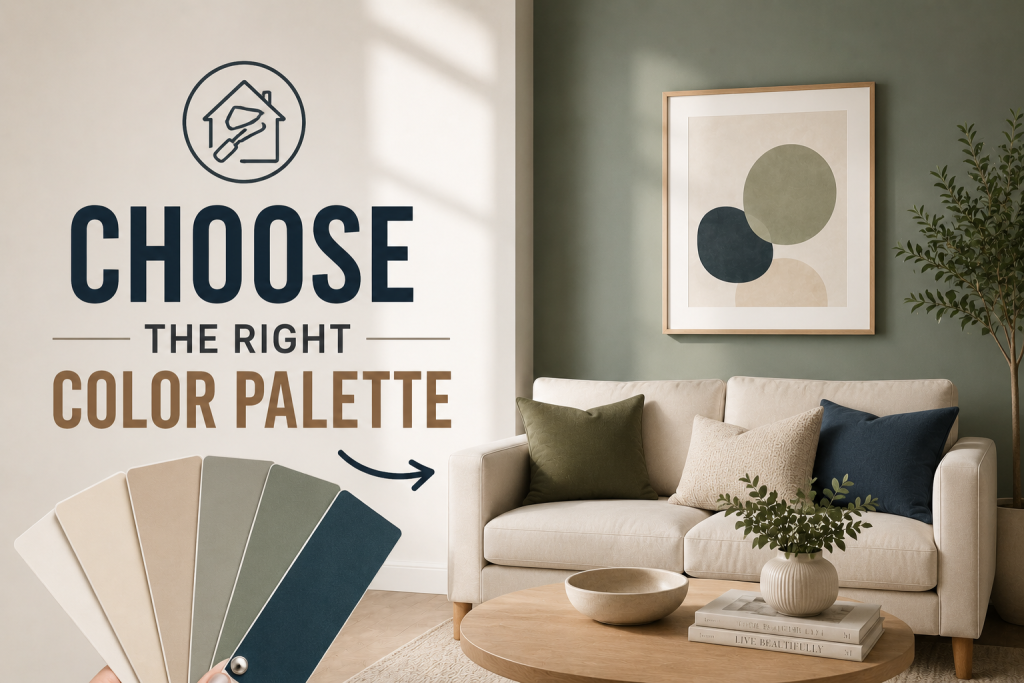
Modern American homes increasingly rely on simplified, intentional types of color palettes that prioritize cohesion, comfort, and long-term design flexibility. Instead of overly complex schemes, homeowners are leaning toward curated modern interior palettes that work across open floor plans and multi-use spaces. One of the most popular directions is soft neutrals paired with subtle accent tones. For example, warm whites combined with muted greens or soft taupe paired with charcoal accents create balanced home color combinations that feel both current and timeless. These palettes are especially common in new builds across suburban developments in Texas, Arizona, and Florida.
Designers also continue to incorporate refined versions of classic systems like monochromatic and analogous schemes, but with more muted, desaturated tones to suit contemporary tastes. Paint manufacturers such as Sherwin-Williams and Benjamin Moore frequently release coordinated collections that simplify this process for homeowners. The result is a more cohesive, livable approach to color that aligns with modern US interior design trends.
Common Mistakes in Color Palette Selection
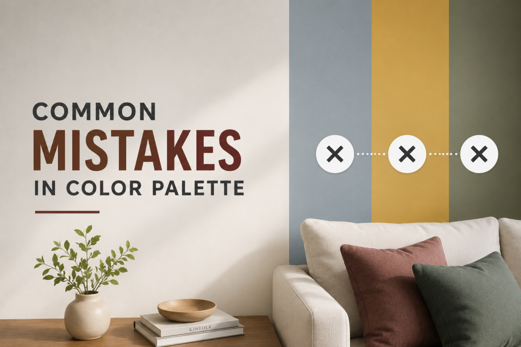
Even with a solid understanding of the types of color palettes, homeowners often make avoidable mistakes that can disrupt the overall balance of a space. One of the most common issues is selecting colors without considering lighting conditions, which can dramatically alter how home color combinations appear once applied to walls. Another frequent mistake is mixing too many palette systems within the same home. While modern interior palettes can be flexible, combining monochromatic, complementary, and triadic schemes without a clear strategy often results in visual inconsistency and cluttered interiors.
Overusing bold or highly saturated tones is another challenge. Without enough neutral grounding, even well-planned interior color theory can feel overwhelming or chaotic, especially in smaller rooms or open-concept layouts. Finally, many homeowners rely solely on small paint samples instead of testing colors in real room conditions. This often leads to unexpected undertones that clash with furniture, flooring, or natural light.
Conclusion
Understanding the different types of color palettes helps homeowners make more intentional and visually balanced design decisions. From structured systems like monochromatic schemes to high-contrast complementary combinations, each approach plays a unique role in shaping mood, flow, and style. By applying interior color theory to real spaces, you can create cohesive interiors that feel both functional and aesthetically refined. The key is choosing palettes that match your lighting, layout, and lifestyle while maintaining overall harmony.
FAQ About Types of Color Palettes
What are the main types of color palettes in interior design?
The main types of color palettes include monochromatic, complementary, analogous, and triadic schemes, all based on interior color theory principles.
What is a monochromatic color scheme?
A monochromatic color scheme uses different shades and tones of a single color to create a cohesive and minimalist look in interior spaces.
How do complementary colors work in home design?
Complementary colors sit opposite each other on the color wheel and create high contrast, often used for accents and focal points in home color combinations.
What is the best color palette for modern homes?
There is no single best option, but modern interior palettes often blend neutral bases with subtle accent colors for balance and flexibility.