


Common Interior Paint Color Mistakes Homeowners Make
Understanding interior paint color mistakes is essential for homeowners who want to avoid costly repainting, poor design outcomes, and mismatched interiors. Paint color decisions often seem simple at first, but in reality, they involve lighting, undertones, room size, and material coordination. Many homeowners choose colors based on small swatches or online inspiration without considering how those colors will behave in real US home environments. This leads to issues like wrong undertones, overly dark rooms, or colors that clash with flooring and furniture.
The goal of this guide is to break down the most common interior decorating mistakes and explain why they happen. More importantly, it provides practical home painting tips to help you choose colors that work in real conditions, not just in theory. By understanding these mistakes early, homeowners can make smarter decisions and achieve more cohesive, long-lasting interior results.
Why Interior Paint Color Mistakes Are So Common
Many interior paint color mistakes happen because homeowners underestimate how complex color selection actually is. On the surface, choosing paint seems simple, pick a shade you like and apply it, but in reality, color behaves differently depending on lighting, surface texture, and surrounding materials. One major reason mistakes occur is the reliance on digital images or small paint swatches. These do not accurately represent how a color will appear across an entire wall or room. In real homes, especially across different US climates and lighting conditions, colors can shift dramatically throughout the day.
Another issue is the lack of understanding of wrong paint undertones. A color that looks neutral on a sample card may reveal unexpected warm or cool undertones once applied, leading to clashes with flooring, cabinetry, or furniture. Finally, many homeowners skip proper planning in favor of quick decisions, increasing the likelihood of interior decorating mistakes that could have been avoided with testing and preparation.
Wrong Paint Undertones Explained
One of the most common interior paint color mistakes homeowners make is ignoring or misreading undertones. Every paint color has a subtle base, either warm (yellow, red, beige) or cool (blue, green, gray), and these wrong paint undertones often only become obvious after the paint is on the wall. The issue usually appears when a color is paired with fixed elements like flooring, countertops, or cabinets. For example, a gray paint with cool blue undertones can clash with warm wood floors, creating a visually “off” or unbalanced look. This is one of the most overlooked choosing paint colors problems in residential design.
Lighting also plays a major role in revealing undertones. Natural daylight may show one version of a color, while artificial lighting can shift it entirely, exposing unexpected tones that weren’t visible on the sample. Understanding undertones is essential because it determines whether a room feels cohesive, or unintentionally mismatched and visually uncomfortable.
Lighting and Paint Color Problems
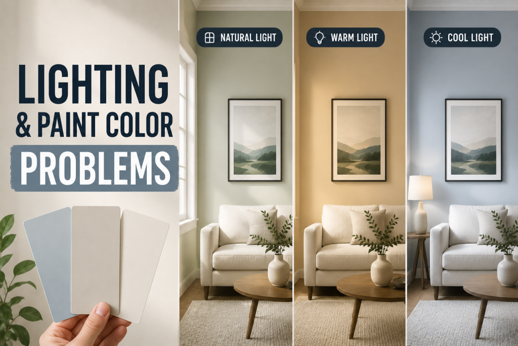
Lighting is one of the biggest factors behind interior paint color mistakes, yet it is often overlooked during the planning stage. The same paint color can look completely different depending on whether it is exposed to natural daylight, warm incandescent bulbs, or cool LED lighting. In many US homes, especially those with mixed lighting sources, this creates unexpected shifts in tone. A soft neutral may appear too yellow in warm lighting or too gray in cooler artificial light. These inconsistencies are a major cause of lighting and paint color issues that only become obvious after painting is complete.
Room orientation also matters. North-facing rooms tend to receive cooler, indirect light, which can make colors appear darker and more muted. South-facing rooms, on the other hand, receive warmer and brighter light, often intensifying undertones. Failing to test paint under real lighting conditions is one of the most common home painting tips mistakes homeowners make, leading to disappointing and costly repainting decisions.
Dark Paint Mistakes in Small Rooms
One of the most noticeable interior paint color mistakes homeowners make is using dark paint in small or poorly lit rooms without a clear design strategy. While deep tones like charcoal, navy, or forest green can look sophisticated, they can also make compact spaces feel even tighter if not balanced correctly. This issue often comes down to misunderstanding spatial perception. Dark colors absorb light, which reduces visual depth and can make walls feel closer than they actually are. In smaller bedrooms, bathrooms, or apartments, this effect can intensify feelings of confinement if there isn’t enough natural or artificial lighting.
However, dark tones are not always a mistake. When used intentionally with proper contrast, such as light trim, reflective surfaces, or accent lighting, they can create a dramatic, high-end look. The key is understanding how choosing paint colors interacts with room size and lighting conditions. Without this balance, homeowners risk creating spaces that feel heavy, closed-in, or visually unbalanced.
Choosing Paint Colors Without Testing Samples
One of the most preventable interior paint color mistakes is selecting a color without properly testing it in the actual room. Many homeowners rely on small swatches or online images, but these do not accurately reflect how a color will appear once applied across full wall surfaces. Paint behaves differently depending on wall texture, lighting, and surrounding materials. This is why skipping sample testing often leads to unexpected results such as wrong paint undertones becoming visible only after the entire room is painted. A color that looks perfect in the store may appear too warm, too cool, or too dark at home.
Proper paint sampling tips include applying large test patches on multiple walls and observing them at different times of day. This helps reveal how natural and artificial lighting affects the color throughout daily cycles. By testing before committing, homeowners can avoid costly repainting and ensure their chosen shade truly fits the space.
Interior Decorating Mistakes That Affect Color
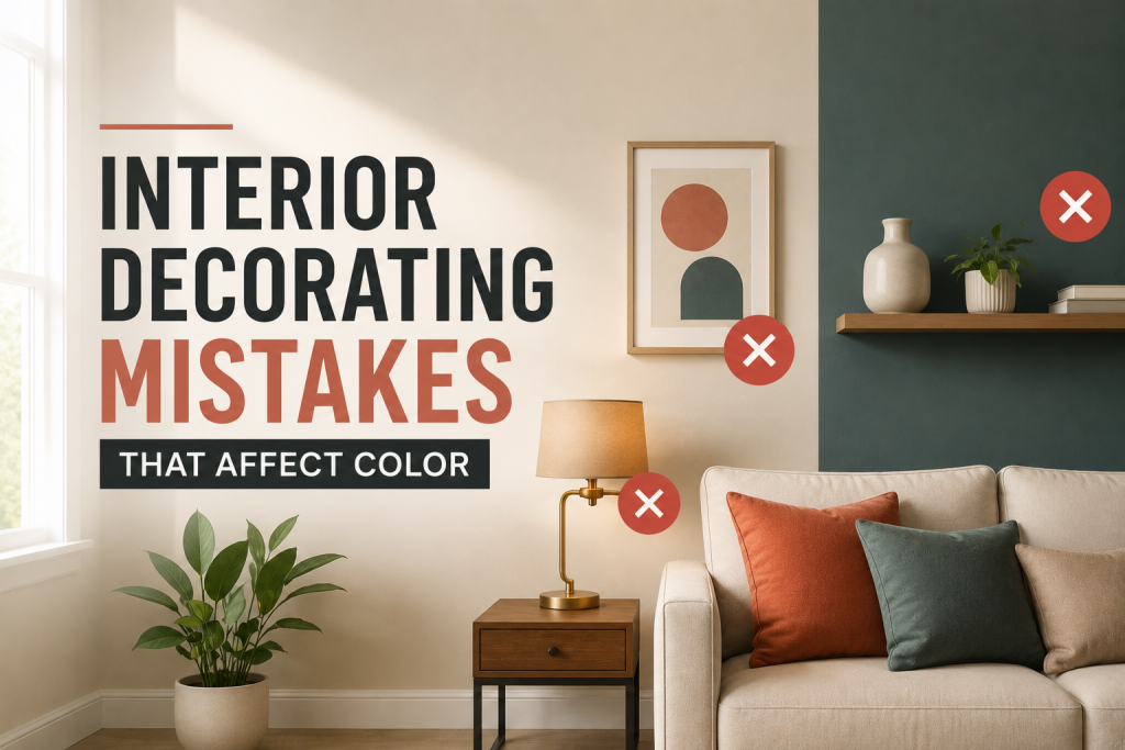
Many interior paint color mistakes are not caused by the paint itself, but by surrounding design choices that influence how color is perceived. Furniture, flooring, textiles, and décor all interact with wall color, often changing the overall look of a room more than expected. One common interior decorating mistakes issue is ignoring undertone harmony between paint and fixed elements. For example, a cool gray wall paired with warm wood furniture can create visual tension if not balanced properly. This is a frequent challenge in choosing paint colors for existing homes where materials cannot easily be changed.
Another mistake is overcrowding a space with competing colors and patterns. Even a well-chosen wall color can feel off if it is surrounded by too many contrasting tones, reducing the effectiveness of the overall palette. Successful color design depends on coordination. When walls, furniture, and accents work together, the result is a cohesive environment that feels intentional and visually balanced.
Paint Sampling Tips for Better Results
Using the right paint sampling tips is one of the most effective ways to avoid common interior paint color mistakes and ensure the final result matches expectations. Sampling is not just about picking a small swatch, it’s about testing how a color behaves in real living conditions. The first step is to apply large sample patches directly on multiple walls, not just one. This allows you to see how light changes the color throughout the day, especially in rooms with varying exposure. This is crucial when evaluating lighting and paint color interactions in US homes where natural light shifts significantly by season and time of day.
It’s also important to test colors alongside existing furniture, flooring, and trim. These elements can dramatically influence how undertones appear, helping you identify potential wrong paint undertones before committing. Finally, observe samples at night under artificial lighting to ensure consistency. This simple process prevents costly repainting and improves overall design confidence.
How to Choose Paint Colors Correctly
Choosing paint colors correctly requires a structured approach that reduces the risk of common interior paint color mistakes and ensures long-term satisfaction. Instead of starting with a favorite shade, the best approach begins with understanding the room’s function, lighting conditions, and existing materials. A key step in choosing paint colors is identifying a base neutral that works with flooring, cabinetry, and furniture. This foundation helps avoid conflicts caused by wrong paint undertones, which often appear when colors are selected in isolation.
Next, consider how natural and artificial lighting affects the space throughout the day. Rooms with strong sunlight can handle deeper tones, while darker rooms benefit from lighter, reflective shades to improve brightness and balance. Finally, build a cohesive palette rather than selecting a single color. This ensures proper color coordination in interiors and helps maintain consistency across connected spaces, especially in open-concept US homes. A methodical process leads to more accurate, lasting, and visually balanced design outcomes.
Conclusion
Avoiding interior paint color mistakes comes down to preparation, observation, and understanding how color behaves in real environments. By paying attention to undertones, lighting, and proper sampling, homeowners can significantly improve design outcomes and reduce costly repainting errors. Good home painting tips are not just about choosing attractive colors, they are about ensuring those colors work harmoniously within the full context of the home.
FAQ – Interior Paint Color Mistakes
What are the most common interior paint color mistakes?
The most common interior paint color mistakes include ignoring lighting conditions, choosing colors without testing samples, and misreading undertones that clash with existing finishes.
How do I avoid wrong paint undertones?
To avoid wrong paint undertones, always compare paint samples against flooring, furniture, and trim under both natural and artificial lighting before making a final decision.
Why does lighting affect paint color so much?
Lighting changes how we perceive color. This is a major factor in lighting and paint color issues, as natural daylight and artificial bulbs can shift undertones dramatically.
What are the best paint sampling tips?
Effective paint sampling tips include testing large swatches on multiple walls and observing them at different times of day before committing.