

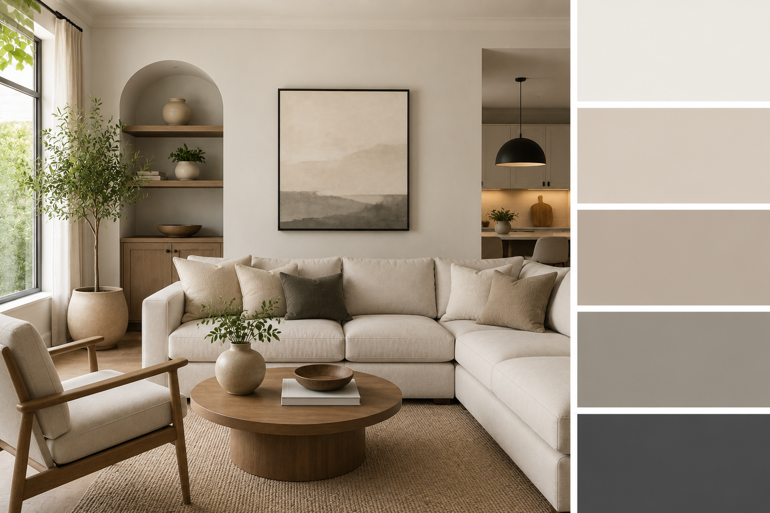
Top Neutral Color Palettes for Modern American Homes
Neutral design has become the foundation of modern American interiors, and neutral color palettes continue to dominate both new construction and home renovation projects. From suburban homes in Texas to coastal properties in California, homeowners increasingly prefer soft, versatile tones that create calm, cohesive living spaces. The appeal of modern neutral paint colors lies in their flexibility. They work with nearly any furniture style, adapt well to changing decor trends, and support strong resale value. Unlike bold color schemes, neutrals provide a timeless backdrop that feels clean and intentional without overwhelming a space. Popular combinations like beige and gray color schemes, greige blends, and warm off-whites are widely used across open-concept layouts and minimalist interiors. Paint brands such as Sherwin-Williams and Benjamin Moore have also expanded their neutral collections to meet rising demand. This guide explores how to choose and apply the most effective neutral palettes for modern US homes.
Why Neutral Color Palettes Dominate Modern Interior Design
Neutral color palettes have become the dominant choice in modern American homes because they offer a balance of simplicity, flexibility, and long-term design stability. Unlike bold or highly saturated colors, neutrals create a consistent visual foundation that works across different rooms and architectural styles. One of the main reasons modern neutral paint colors are so popular is their ability to adapt to changing furniture, lighting, and decor trends. Homeowners can update accessories, flooring, or accent pieces without needing to repaint entire spaces, making neutrals a practical long-term investment.
In US housing markets, especially in suburban developments and new construction homes, neutral tones are also closely tied to resale appeal. Buyers tend to prefer clean, move-in-ready spaces, and contemporary paint colors like soft whites, warm grays, and taupe shades help achieve that look. Ultimately, neutral palettes dominate because they are both visually calming and highly functional in everyday living environments.
Warm Neutral Interiors for Cozy Modern Homes
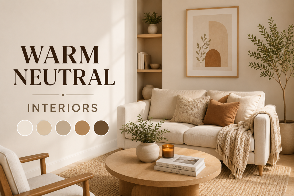
Warm tones play a major role in today’s neutral color palettes, especially for homeowners who want interiors that feel inviting rather than stark or overly minimal. Warm neutral interiors typically include shades like creamy whites, soft beige, warm taupe, and light caramel tones that add subtle depth without overpowering a space. These colors work particularly well in living rooms, bedrooms, and open-concept areas where comfort is a priority. Unlike cooler grays, warm neutrals create a softer atmosphere that feels more lived-in and approachable, making them ideal for family-focused US homes.
Paint brands such as Sherwin-Williams and Benjamin Moore often highlight warm neutrals in their trending collections because they perform well in a variety of lighting conditions. They also pair easily with natural materials like wood, linen, and stone, which are commonly used in modern American interiors. Overall, warm neutrals are a key foundation for creating cozy, timeless, and livable home environments.
Cool Neutral Color Palettes for Contemporary Spaces
Cool tones are an essential part of modern neutral color palettes, especially in homes that aim for a clean, contemporary aesthetic. These modern neutral paint colors typically include soft grays, icy whites, muted blue-grays, and subtle stone-inspired shades that create a crisp, refined look. Cool neutrals work particularly well in spaces with strong natural light, such as modern condos, urban apartments, and minimalist US homes. They help enhance brightness while maintaining a sleek, uncluttered appearance that aligns with contemporary paint colors trends.
One advantage of cool neutrals is their ability to create a sense of structure and order. When paired with metal finishes, glass accents, or modern furniture, they reinforce a polished and architectural feel. However, balance is key. Without warmer accents, cool palettes can sometimes feel too sterile. Designers often soften them with wood textures or warm lighting to maintain comfort while preserving a modern edge.
Beige and Gray Color Schemes Explained
Beige and gray combinations are among the most widely used neutral color palettes in modern American homes because they strike a balance between warmth and structure. These beige and gray color schemes work well in both traditional and contemporary interiors, making them a safe and flexible design choice. Beige introduces warmth and softness, while gray adds a sense of modernity and visual grounding. When paired correctly, they create layered interiors that feel intentional rather than flat. This combination is especially popular in open-concept layouts where a unified palette is needed across large connected spaces.
Many homeowners choose these tones when aiming for resale-friendly interiors, as they appeal to a broad range of buyers. Paint manufacturers like Sherwin-Williams and Benjamin Moore offer extensive variations of beige and gray to suit different lighting conditions and architectural styles. When used thoughtfully, this pairing creates a timeless, adaptable foundation for nearly any home design style.
Why Greige Paint Colors Are So Popular
Greige paint colors a blend of gray and beige have become one of the most in-demand elements in modern neutral color palettes because they offer the best of both warmth and coolness. This hybrid tone adapts easily to different lighting conditions, making it a reliable choice for a wide range of US home styles. Unlike pure gray, greige feels softer and more inviting, while still maintaining the clean, contemporary look associated with modern neutral paint colors. It works especially well in open-concept homes where consistency across multiple rooms is important.
Designers often recommend greige for homeowners who want flexibility without committing to a strictly warm or cool scheme. It pairs well with wood finishes, black accents, and soft textiles, making it highly versatile in both minimalist and transitional interiors. Because of its balance and adaptability, greige has become a staple in contemporary paint colors used in both new builds and renovation projects.
How to Build a Whole House Neutral Palette
Creating a whole house neutral palette requires more than picking a single paint color—it involves building a coordinated system of neutral color palettes that flow seamlessly from room to room. The goal is to maintain consistency while allowing each space to feel slightly distinct. Most designers start with a base neutral, such as warm white, soft greige, or light beige, and then build variations of that tone for different areas of the home. This approach ensures visual continuity while preventing the interior from feeling flat or repetitive.
In modern American homes, especially open-concept layouts, this strategy is essential for maintaining cohesion across kitchens, living rooms, and hallways. Subtle shifts in undertone can define zones without breaking the overall flow of modern neutral paint colors. Paint brands like Sherwin-Williams and Benjamin Moore often design coordinated collections specifically for this purpose, helping homeowners build balanced, resale-friendly interiors with minimal visual conflict.
Minimalist Home Colors for a Clean Modern Look
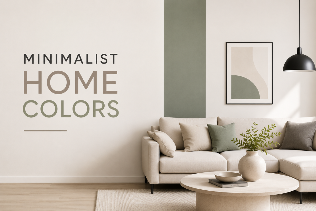
Minimalist design relies heavily on carefully selected neutral color palettes to create calm, uncluttered interiors that feel intentional and balanced. In this style, color is used sparingly, with an emphasis on simplicity, light, and visual harmony. Common minimalist home colors include crisp whites, soft greige, pale stone gray, and muted beige tones. These modern neutral paint colors help reduce visual noise and allow architectural features, furniture, and natural light to stand out as focal points.
In many contemporary US homes, especially newer builds and urban condos, minimalist palettes are used to create a sense of openness and order. The absence of bold color shifts allows spaces to feel larger and more cohesive, which is especially valuable in smaller floor plans. When combined with clean lines, natural materials, and subtle textures, minimalist neutrals create a timeless interior that feels both modern and highly livable without overwhelming the space.
Common Mistakes When Using Neutral Colors
Even though neutral color palettes are considered safe and versatile, they can easily go wrong if not applied thoughtfully. One of the most common mistakes is choosing a neutral that lacks proper undertone balance, which can make a room feel too yellow, too gray, or visually flat under different lighting conditions. Another frequent issue is overusing similar shades throughout the home without variation. While modern neutral paint colors are meant to create cohesion, too much uniformity can make spaces feel dull and disconnected from natural focal points like furniture or architectural details.
Many homeowners also underestimate the importance of contrast. Without subtle variation in trim, ceilings, or accent tones, even well-designed beige and gray color schemes can feel one-dimensional. Finally, ignoring natural light direction can lead to disappointing results. North-facing rooms often require warmer neutrals, while south-facing spaces can handle cooler tones more effectively for a balanced interior appearance.
Conclusion
Neutral color palettes remain the foundation of modern American interior design because they offer timeless appeal, flexibility, and strong resale value. From warm neutrals to cool greige tones, these shades create balanced, livable spaces that adapt to changing trends and lifestyles. Whether building a whole house neutral palette or selecting a single-room update, the key is understanding undertones, lighting, and consistency. When used correctly, neutral colors create interiors that feel both modern and enduring.
FAQ About Neutral Color Palettes
What are the best neutral color palettes for modern homes?
The best neutral color palettes for modern American homes include warm whites, greige tones, soft beige, and light gray combinations that create a clean, timeless foundation.
Are neutral paint colors still popular in 2026?
Yes. Modern neutral paint colors remain one of the most popular choices because they offer flexibility, resale appeal, and compatibility with changing interior design trends.
What is the difference between beige, gray, and greige?
Beige is warm and soft, gray is cool and modern, and greige combines both, making it one of the most versatile beige and gray color schemes available.
How do I choose the right neutral for my home?
Consider lighting, room size, and existing finishes. Testing samples in different lighting conditions helps ensure the chosen neutral works throughout the day.