


Neutral vs Bold Color Schemes: Which Works Better?
Choosing between neutral vs bold color schemes is one of the most important design decisions homeowners make when planning an interior update. The direction you choose affects not only the visual style of your home but also its mood, functionality, and long-term resale appeal. Neutral color schemes, including whites, grays, and soft beiges, are known for their versatility and timelessness. They create calm, cohesive interiors that appeal to a wide range of buyers. In contrast, bold interior paint colors such as deep navy, emerald green, or terracotta introduce personality, contrast, and strong visual impact. Modern homeowners in the US often struggle to balance safety with expression, especially when following current interior color trends. While neutrals offer stability, bold tones create identity and focal points within a space. This guide breaks down both approaches so you can decide which direction, or combination, best fits your home and lifestyle.
What Are Neutral vs Bold Color Schemes?
Understanding neutral vs bold color schemes starts with recognizing how each category is defined in interior design. Neutral schemes typically include soft, understated tones such as white, beige, taupe, gray, and greige. These minimalist color palettes are designed to blend seamlessly with furniture, lighting, and architectural elements without drawing too much attention to any single feature. Bold color schemes, on the other hand, rely on saturated and high-impact hues like deep blue, forest green, charcoal black, terracotta, or rich jewel tones. These bold interior paint colors are used to create contrast, highlight focal points, and add personality to a space.
In US homes, neutrals are often chosen for whole-house consistency, while bold tones are used more selectively for accent walls or specific rooms. This balance allows homeowners to maintain a cohesive foundation while still incorporating expressive, dramatic design elements. Ultimately, both approaches serve different emotional and visual purposes within modern interiors.
Benefits of Neutral Interior Color Schemes
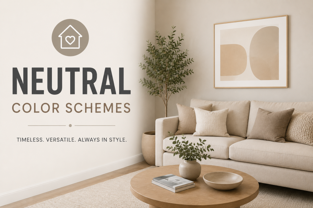
Neutral color schemes are widely used in US homes because they offer long-term flexibility, visual balance, and strong resale appeal. Shades like white, beige, gray, and greige create a calm foundation that works with almost any furniture style or décor trend, making them a safe and practical choice for homeowners. One of the biggest advantages of minimalist color palettes is their ability to make spaces feel larger and more open. This is especially important in smaller homes or open-concept layouts where consistency across rooms is essential. Neutral tones also adapt well to changing lighting conditions, maintaining a stable appearance throughout the day.
From a resale perspective, real estate professionals often recommend neutral interiors because they appeal to a wider range of buyers. A neutral backdrop allows potential homeowners to easily imagine their own style in the space, which can increase marketability. Brands like Sherwin-Williams and Benjamin Moore consistently highlight neutrals in their most popular collections due to their timeless, versatile nature.
Benefits of Bold Interior Paint Colors
Bold interior paint colors bring energy, personality, and visual impact to a space, making them a powerful tool in modern design. Unlike neutral schemes, bold tones are meant to stand out and create focal points that define a room’s identity. One of the main advantages of bold interior paint colors is their ability to transform ordinary spaces into expressive environments. Deep blues, rich greens, terracotta, and charcoal tones can add depth and drama, especially when used strategically on accent walls or in smaller rooms where a strong design statement is desired.
In current interior color trends, bold shades are increasingly used in living rooms, dining areas, and home offices to create distinctive, memorable interiors. They work particularly well when paired with neutral furnishings, allowing color to take center stage without overwhelming the space. While bold schemes require more confidence in design decisions, they offer a high level of customization and can significantly enhance a home’s character and visual appeal.
Room Color Psychology: How Colors Affect Mood
Room color psychology plays a major role in deciding between neutral vs bold color schemes, because different colors influence how people feel and behave within a space. Understanding these emotional effects helps homeowners make more intentional design choices. Neutral tones generally promote calmness, stability, and relaxation. This is why minimalist color palettes are often used in bedrooms, living rooms, and shared spaces where a peaceful atmosphere is desired. These colors reduce visual stimulation and create a balanced backdrop for daily living.
In contrast, bold colors tend to stimulate energy, creativity, and focus. Shades like deep blue, emerald green, and terracotta can make a space feel more dynamic and expressive. This is why bold interior paint colors are often used in home offices, dining rooms, or feature walls where impact is desired. Ultimately, color psychology helps explain why some rooms feel soothing while others feel vibrant, even when furniture and layout remain the same.
When to Use Statement Wall Colors
Statement wall colors are a strategic way to introduce bold design without committing to an entire room of strong pigment. This approach is especially useful when working with neutral vs bold color schemes, allowing homeowners to balance safety with personality. A statement wall works best when a room already has a neutral foundation. In spaces with minimalist color palettes, a single bold wall, such as deep navy, forest green, or terracotta, can create a focal point without overwhelming the overall design. This is a common approach in modern US homes where flexibility and resale value still matter.
Statement walls are often used behind beds, sofas, or dining tables to anchor the space visually. They can also help define zones in open-concept layouts, especially when paired with complementary lighting and furniture. When applied correctly, bold interior paint colors used in accent form can enhance depth and character while maintaining a balanced and intentional interior.
Minimalist vs Dramatic Design Styles
The contrast between minimalist and dramatic interiors plays a major role in how homeowners approach neutral vs bold color schemes. Each style reflects a different design philosophy, influencing not only color choice but also furniture, lighting, and overall spatial feel. Minimalist design relies heavily on minimalist color palettes, typically built around soft neutrals like white, beige, and light gray. The goal is to create calm, uncluttered spaces that emphasize simplicity and function. In these interiors, color is used subtly to support openness and visual flow, making rooms feel larger and more cohesive.
Dramatic design, on the other hand, embraces contrast and depth. It often incorporates bold interior paint colors such as deep charcoal, emerald green, or navy blue to create strong focal points and emotional impact. These spaces feel more expressive and layered, with color acting as a central design feature rather than a background element. Both styles can work in modern homes, the choice depends on how much visual intensity and personality you want in your space.
Modern Home Color Ideas in 2026
Modern interior color trends in 2026 are increasingly focused on blending neutral vs bold color schemes rather than choosing one extreme. Homeowners are moving toward layered interiors where soft neutrals form the foundation and controlled bold accents add personality and depth. nPopular modern home color ideas include warm whites paired with muted earthy tones, soft greige walls with deep green accents, and beige-based palettes balanced with charcoal or navy statement elements. This approach allows for flexibility while still incorporating expressive bold interior paint colors in a measured way.
In many US homes, especially new builds and renovated suburban properties, designers are also using color zoning, assigning different tones to specific areas within open-concept layouts. This helps define spaces without relying on walls or partitions. Paint brands like Sherwin-Williams and Benjamin Moore continue to promote curated palettes that support this balanced design direction, making it easier for homeowners to combine warmth, neutrality, and bold accents effectively.
Neutral vs Bold: Which Is Better for Resale Value?
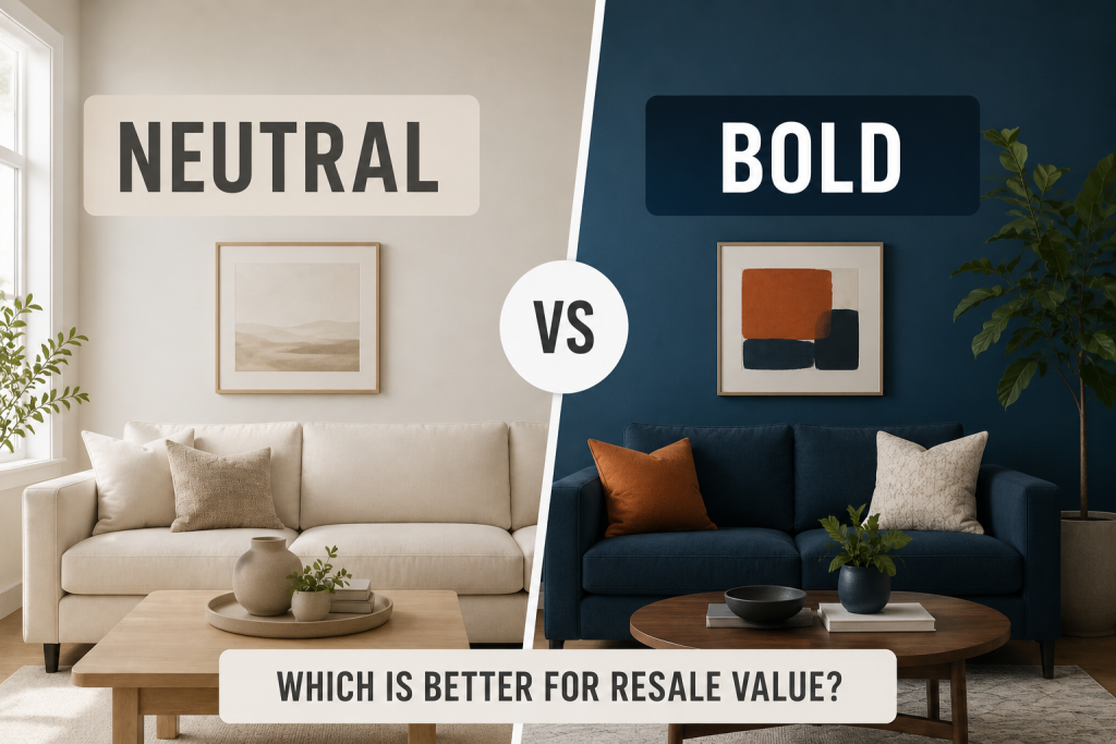
When comparing neutral vs bold color schemes from a real estate perspective, neutral interiors generally have the advantage in resale value. Buyers tend to prefer homes with neutral color schemes because they create a clean, move-in-ready appearance that allows them to imagine their own furniture and style in the space. Shades like white, beige, greige, and soft gray are widely recommended by real estate professionals because they appeal to a broader audience and reduce perceived renovation costs. These minimalist color palettes also help rooms feel brighter and more spacious, which can positively influence buyer perception during showings.
Bold interior paint colors, while visually striking and expressive, can be more polarizing. Strong colors may require repainting for some buyers, which can limit appeal in competitive markets. However, when used strategically as accent walls or in modern interior color trends, bold tones can still add character without negatively impacting value. Ultimately, neutrals offer safer resale potential, while bold schemes work best when used with restraint.
Conclusion
Choosing between neutral vs bold color schemes depends on your design goals, lifestyle, and long-term plans. Neutrals offer timeless flexibility and resale strength, while bold colors provide personality and visual impact. In modern homes, the most effective approach is often a balanced combination of both. By understanding room color psychology, homeowners can confidently design interiors that feel both functional and expressive without sacrificing cohesion or value.
FAQ About Neutral vs Bold Color Schemes
What is the main difference between neutral vs bold color schemes?
The main difference is intensity and impact. Neutral color schemes use soft, muted tones like white, beige, and gray, while bold interior paint colors rely on saturated hues like navy, emerald, or terracotta for stronger visual effect.
Are neutral color schemes better for resale value?
Yes, in most cases. Minimalist color palettes tend to appeal to more buyers because they create a clean, move-in-ready look that feels universally appealing.
When should I use bold interior paint colors?
Bold colors work best in accent walls, dining rooms, or home offices where you want to create focus and personality without overwhelming the entire space.
Can you combine neutral and bold colors in one home?
Yes. Many modern homes use neutral vs bold color schemes together, pairing neutral foundations with selective bold accents for balance and visual interest.