


How Paint Colors Affect Mood, Lighting, and Resale Value?
Paint color psychology is the study of how different colors influence human emotions, perception, and behavior inside interior spaces. In home design, it explains why a room can feel calming, energizing, spacious, or even uncomfortable, without any changes to the layout or furniture. At its core, interior house color psychology connects visual input with emotional response. Warm tones tend to create comfort and relaxation, while cooler tones often promote clarity and calm structure. Even neutral shades can shift emotional tone depending on their undertones and surrounding materials.
This concept is especially important in residential spaces because walls make up the largest visual surface in a home. Unlike furniture or décor, paint sets the baseline mood for every room and influences how people experience daily life. It also plays a key role in lighting and paint shade colors, since natural daylight and artificial lighting can dramatically change how a color is perceived throughout the day. A shade that feels soft and warm in sunlight may appear cooler or more muted at night. Understanding color psychology allows homeowners to make intentional decisions that improve comfort, functionality, and long-term design satisfaction.
How Fascinating Paint Colors Influence Daily Living?
When applied correctly, fascinating paint colors can significantly shape how a home feels and functions on a day-to-day basis. This is where paint color psychology moves from theory into real-life impact, influencing everything from relaxation levels to productivity and social comfort.
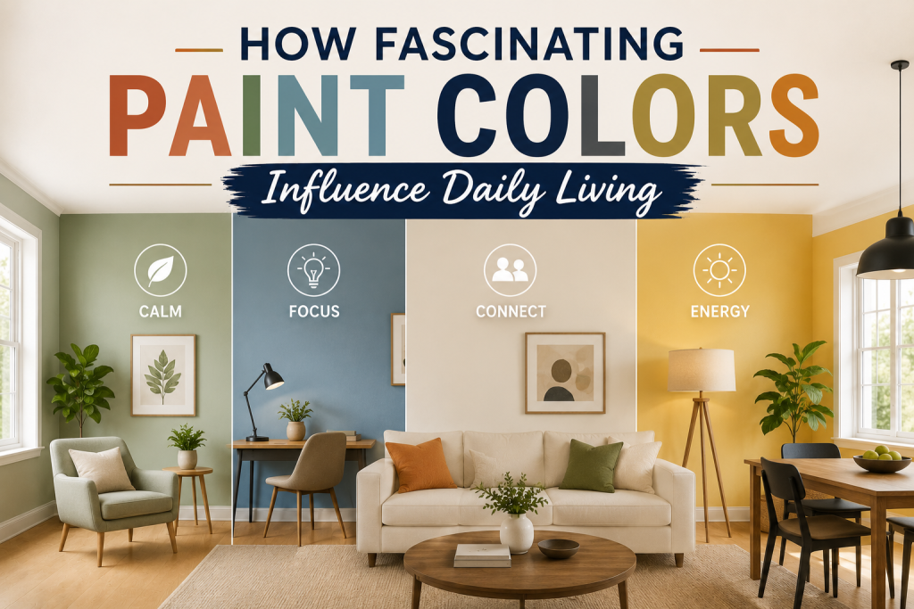
- Warm tones such as soft beige, muted terracotta, and creamy off-whites tend to create a sense of comfort and ease. These colors are often used in living rooms and bedrooms because they support relaxation and emotional stability. In many homes, these tones also overlap with home resale paint colors, since they appeal to a wide range of buyers.
- Cooler tones, including soft blues, pale grays, and green-based neutrals, tend to encourage calm focus and clarity. These are commonly used in bathrooms, home offices, and transitional spaces where concentration or cleanliness is important.
- The impact of these colors is closely tied to room lighting results. A calming blue may feel serene in natural daylight but slightly colder under artificial lighting. Similarly, warm neutrals can feel more inviting in evening light but richer and deeper during the day.
Ultimately, choosing the right mood-enhancing palette is about matching emotional intent with real-world lighting conditions and daily lifestyle patterns.
Interior Paint Color Psychology and Emotional Response
Interior color psychology explains how paint choices directly influence emotional reactions, behavior, and overall comfort inside a home. Within the framework of paint color psychology, every shade, whether bold or neutral, creates a subtle psychological effect that shapes how a space is experienced. Warm colors tend to produce emotional comfort and familiarity. Soft creams, beiges, and earthy tones can make a room feel grounded and secure, which is why they are often selected for family living areas. These tones also align closely with neutral colors for exchange, since they appeal to a wide audience and reduce emotional resistance during home viewings.
Cool colors, on the other hand, promote calmness and mental clarity. Light grays, soft blues, and muted green tones are often used in bedrooms, bathrooms, and workspaces to create a more focused and relaxed environment. These shades can also help balance strong lighting and paint colors in rooms with intense natural light. Neutral palettes sit between these two extremes, offering flexibility without strong emotional bias. This is especially useful in open-concept homes where consistent tone and flow matter more than room-by-room contrast. By understanding these emotional effects, homeowners can make more intentional decisions that improve both daily living experience and long-term property appeal.
Lighting and paint shade colors: Why Light Changes Everything
One of the most important factors in paint color psychology is how dramatically lighting and paint shade colors interact. The same shade can feel warm, cool, bright, or muted depending entirely on the type and direction of light in a space. Natural daylight has the strongest influence. Rooms with abundant sunlight often make colors appear lighter and more vibrant, which can enhance mood-enhancing paint colors but also expose hidden undertones. For example, a neutral gray may shift slightly blue in north-facing light or appear warmer in south-facing rooms.
Artificial lighting also plays a major role. Warm LED or incandescent bulbs tend to soften colors and bring out yellow or beige tones, while cooler daylight bulbs emphasize blue and gray undertones. This shift can significantly affect how house resale paint colors are perceived during evening showings or indoor photography. Even the time of day matters. Morning light, afternoon brightness, and evening artificial lighting all change how a paint color reads on the wall, which is why testing samples is critical in real environments. Understanding these lighting effects ensures that chosen colors maintain consistency, balance, and emotional intent across all conditions in the home.
Room Lighting Results on Paint Perception
When working with paint color psychology, understanding room lighting effects is essential because lighting can completely change how a color behaves once it’s on the wall. A paint shade that feels balanced in one room may look entirely different in another due to orientation, window size, and light intensity. North-facing rooms typically receive cooler, indirect light. This can make colors appear more muted and slightly gray-toned, often reducing the warmth of fascinating paint colors. In these spaces, warmer tones are often used to restore balance and prevent the room from feeling flat or overly cool. South-facing rooms receive stronger, warmer light throughout the day. This enhances brightness and can intensify undertones in both warm and cool paints.
As a result, neutral colors for exchange often appear richer and more dynamic in these environments, but they must be carefully selected to avoid looking overly warm. Artificial lighting further complicates perception. LED and incandescent lighting can shift how interior house color psychology is experienced in the evening, sometimes making walls appear warmer or cooler than they do during daylight hours. Because of these variations, testing paint under multiple lighting conditions is critical for ensuring consistent results and avoiding unexpected undertone shifts after application.
House Resale Paint Colors That Increase Value
In paint color psychology, one of the most commercially important applications is selecting house resale paint colors that positively influence buyer perception. Color doesn’t just affect mood; it directly impacts how spacious, clean, and modern a home feels during showings. Neutral palettes consistently perform best in resale environments. Soft whites, light grays, and warm beige tones are widely used because they create a blank canvas effect. These neutral colors for exchange reduce visual distractions and help potential buyers imagine their own furniture and lifestyle in the space.
These colors also support home staging paint colors strategies, where the goal is to make the home feel move-in ready. A well-chosen neutral can make rooms appear larger, brighter, and more updated, which increases emotional appeal during first impressions. Lighting also plays a major role in resale performance. Homes are viewed under varying conditions: natural daylight, artificial lighting, and mixed exposure. Colors that maintain consistency across these environments tend to perform better in real estate contexts. Ultimately, resale-focused color choices are not about personal preference; they are about maximizing broad appeal, reducing hesitation, and strengthening perceived value in competitive markets.
Neutral colors for exchange and Buyer Appeal
In paint color psychology, neutral colors for exchange are one of the most reliable strategies for increasing buyer interest and improving a home’s perceived value. These colors work because they reduce emotional resistance and allow potential buyers to imagine themselves living in the space without distraction. Soft whites, light grays, warm beiges, and subtle greiges are commonly used because they create a clean and universally appealing backdrop. Unlike highly personalized or bold colors, these tones support broad market acceptance and align well with house resale paint colors strategies used in professional staging.
Neutrals also play a key role in interior house color psychology by creating emotional neutrality. Instead of influencing strong mood responses, they allow architecture, lighting, and furnishings to take center stage. This makes rooms feel more open, balanced, and adaptable. Another advantage is consistency under varying room lighting conditions. Neutral tones tend to hold their appearance more reliably across daylight, artificial lighting, and mixed conditions, which is especially important during home showings and listing photography. Overall, neutral palettes help reduce hesitation in buyers by creating a fresh, move-in-ready impression that supports faster and more confident purchasing decisions.
How to Apply Paint Color Psychology in Real Homes Like a Pro?
Turning paint color psychology into real results requires a structured approach that connects emotion, lighting, and resale strategy. Instead of choosing colors based on preference alone, professionals evaluate how each space functions, how it is lit, and how it should feel long-term.
Paint Color Psychology: Start With the Emotional Purpose of Each Room
Every room should have a defined emotional goal. Bedrooms may prioritize calmness, while kitchens benefit from brightness and energy. Aligning choices with interior house color psychology ensures each space supports how it is actually used day to day.
Build a Base Using Neutral Colors First
Most successful designs start with neutral colors for resale, such as soft whites, warm grays, or beige tones. These act as a stable foundation, allowing flexibility in décor while maintaining long-term visual consistency across the home.
Test Colors Under Real Lighting Conditions
Since room lighting results can dramatically change perception, always test samples in morning, afternoon, and evening light. This helps avoid unexpected undertone shifts that can affect mood and design balance after full application.
Align Paint With Furniture and Fixed Materials
Walls should complement flooring, cabinetry, and countertops, not compete with them. Coordinating finishes ensures that fascinating paint colors feel intentional rather than disconnected from the rest of the space.
Think Beyond Individual Rooms to Whole-Home Flow
A strong home styling paint colors strategy considers how colors transition from one room to another. Maintaining consistent undertones creates a seamless experience that improves both comfort and perceived home value.
Home Styling Paint Colors for Faster Sales
In paint color psychology, home styling paint colors are selected with one primary goal: to make a property feel instantly appealing to the widest range of potential buyers. Unlike personal design choices, staging colors are intentionally neutral, balanced, and designed to minimize hesitation during showings. The most effective staging palettes rely heavily on soft whites, light grays, and warm beige tones. These neutral colors for exchange create a clean, updated backdrop that allows buyers to focus on space, layout, and natural light rather than individual color preferences. From a psychological standpoint, staging works because it reduces visual “noise.” When walls are calm and consistent, the brain processes the home as more organized and move-in ready.

This is a core principle of interior house color psychology, where simplicity increases emotional comfort and perceived value. Lighting also plays a major role in staging effectiveness. Because homes are viewed at different times of day, room lighting results can alter how colors appear in photos and in person. Well-chosen neutral tones help maintain consistency across these varying conditions, ensuring the home looks stable and inviting. Ultimately, staging paint colors are not about personal expression; they are about creating emotional clarity, speed of connection, and stronger market performance.
Final Thoughts
Understanding paint color psychology is essential for making informed design decisions that go beyond surface aesthetics. Every color choice influences how a space feels, how it responds to light, and how it is perceived by both residents and potential buyers. From a daily living perspective, interior house color psychology helps shape comfort, focus, and emotional balance. Warm tones can make a home feel more inviting, while cooler tones support calmness and clarity. Neutral palettes, on the other hand, provide flexibility and long-term adaptability as styles and furnishings evolve. Lighting remains one of the most influential factors in how color performs. As seen with lighting and paint shade colors, the same shade can shift dramatically depending on time of day, bulb type, and room orientation. This makes testing and observation a critical step in any paint selection process. For resale-focused projects, house resale paint colors and home styling paint colors play a strategic role in improving buyer perception. Clean, neutral palettes reduce visual friction and help create a move-in-ready impression that often translates into stronger offers. Ultimately, paint is not just decoration; it is a psychological and financial tool that shapes mood, enhances space, and supports long-term property value when used intentionally.
Frequently Asked Questions
What is paint color psychology?
Paint color psychology is the study of how colors influence emotions, behavior, and perception inside interior spaces. It explains why certain shades can make a room feel calming, energizing, spacious, or more confined.
How do house resale paint colors affect value?
House resale paint colors improve perceived value by making a home feel cleaner, more modern, and move-in ready. Neutral tones reduce buyer hesitation and appeal to a wider audience in competitive markets.
What are fascinating paint colors?
Fascinating paint colors are shades chosen to support specific emotional states, such as relaxation in bedrooms, focus in offices, or comfort in living rooms, based on principles of interior house color psychology.
How do lighting and paint shade colors interact?
Lighting and paint shade colors interact by changing how undertones appear throughout the day. Natural and artificial lighting can shift colors warmer, cooler, brighter, or more muted depending on conditions.
What are the best neutral colors for exchange?
The best neutral colors for exchange include soft whites, warm beiges, light grays, and greige tones, all of which perform well under different lighting conditions and appeal to most buyers.