


Understanding Undertones in Paint Colors for US Homes
When working with paint undertones, you’re dealing with the hidden base color that sits underneath the main paint shade. Even if a wall looks “white,” “gray,” or “beige,” it almost always contains subtle undertones that influence how the color appears in real spaces. These undertones are what make two paints that look similar in a store appear completely different once they’re on your walls. For example, a gray with blue undertones can feel cool and crisp, while a gray with brown undertones may read warmer and more grounded. This is especially important when selecting colorless paint colors, where small shifts in undertone can dramatically change the mood of a room.
Understanding undertones is essential for avoiding costly mistakes when choosing fence paint colors, especially in homes with mixed lighting conditions. Natural light, artificial lighting, and even nearby materials like flooring or countertops can all influence how undertones are perceived. This is why professionals rely heavily on undertone analysis when offering paint color matching ideas. It ensures that the selected color doesn’t just look right on a swatch, but also performs correctly once applied across full walls in real home environments.
Warm Undercolor in Interior Paint
When it comes to paint undertones, warm undertones are those that carry subtle hints of yellow, red, peach, or beige. These undertones are what give paint colors a softer, more inviting character, even when the base color appears neutral at first glance. warm undercolor are especially important in residential design because they help create a sense of comfort and familiarity. In living rooms, bedrooms, and dining areas, warm-leaning colors tend to feel more welcoming and relaxed compared to cooler alternatives. This is why many colorless paint colors used in traditional homes lean slightly warm rather than strictly gray or blue-based.
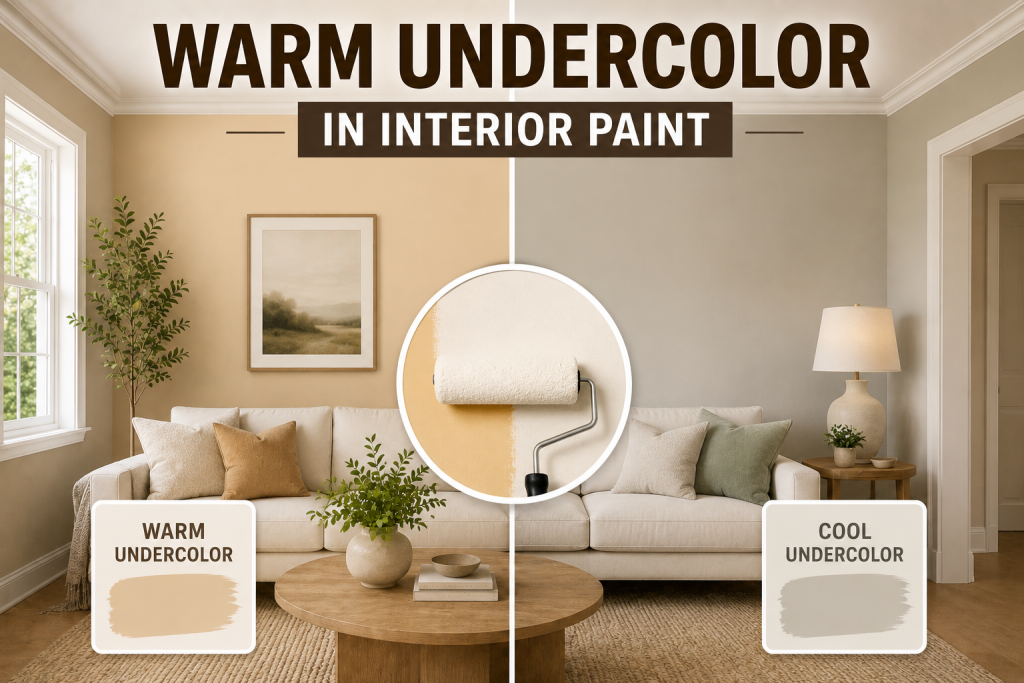
In practice, warm undercolor can significantly influence how a room feels depending on lighting. In spaces with natural sunlight, warm tones become more pronounced, often making walls feel cozier and more golden. Under artificial lighting, they can appear even softer, reinforcing a comfortable atmosphere. However, warm undercolor can also shift perception in unexpected ways. If paired with cooler flooring or modern finishes, they may appear slightly more yellow or creamy than intended. This is why understanding interior color paint psychology is essential when evaluating how undertones interact with the rest of the space. Overall, warm undercolor are a key tool for creating inviting, livable interiors that feel grounded and emotionally comfortable.
Cool paint undertones in Modern Homes
In the world of paint undertones, cool undertones refer to subtle hints of blue, gray, or green that sit beneath the surface of a color. Even when a paint looks like a simple white or neutral gray, these undertones influence whether it feels crisp, airy, or slightly muted once applied to walls. cool undercolor are especially popular in modern interior design because they create a clean, structured aesthetic. They work particularly well in contemporary homes, minimalist spaces, and areas where homeowners want a more refined and polished look. This makes them a common choice when evaluating choosing fence paint colors for kitchens, bathrooms, and open-concept living spaces.
Lighting plays a major role in how cool undercolor behave. In bright natural light, they often appear fresh and bright, enhancing the feeling of openness. However, in low-light environments or rooms with warm artificial lighting, cool tones can sometimes lean more gray or even slightly muted, which is important to consider during planning. cool undercolor also pair well with modern materials like stainless steel, marble, black accents, and glass. This compatibility makes them a strong option within neutral paint colors used in contemporary interior color paint psychology, where clarity and simplicity are key design goals.
Colorless Paint Colors and Subtle Undertones
When discussing paint undertones, colorless paint colors are often the most misunderstood because they appear simple on the surface but still contain hidden warm or cool influences. These subtle undertones are what determine whether a neutral feels inviting, crisp, or perfectly balanced. True neutrals sit between warm undercolor and cool undercolor, but most “neutral” paints still lean slightly in one direction. A gray may carry a hint of blue, making it feel cooler and more modern, while another gray might include beige or brown, creating a softer, warmer appearance. This is where small differences in undertone have a major impact on choosing fence paint colors for a home.
Neutral paints are highly valued in interior design because they offer flexibility. They work well across a wide range of interior color paint psychology applications, allowing homeowners to adjust furniture, lighting, and décor without repainting walls. This is especially useful in open-concept homes where consistency across spaces is important. However, even neutral colors can shift dramatically depending on lighting. Natural daylight may reveal hidden undertones, while artificial lighting can soften or exaggerate them. This is why careful testing is essential when using a paint swatch to evaluate real-world performance. Ultimately, colorless paint colors act as the bridge between warm and cool design styles, offering balance while still carrying subtle undertone behavior that shapes the final look of a space.
Interior Color Paint Psychology and Emotional Impact
Understanding paint undertones goes beyond visual appearance; it also connects directly to interior color paint psychology, which explains how different tones influence mood, perception, and behavior inside a home. Colors with warm undercolor tend to create emotional comfort. They can make a space feel more relaxed, intimate, and welcoming, which is why they are often used in living rooms, bedrooms, and dining areas. These tones support a sense of ease and stability, especially in family-focused spaces where comfort is a priority.
On the other hand, colors with cool undercolor tend to feel more structured and calming differently. They often create a sense of clarity, cleanliness, and openness. This is why cool-toned neutrals are commonly used in bathrooms, kitchens, and modern minimalist interiors where a more refined atmosphere is desired. Colorless paint colors sit in between these two emotional effects. They are widely used in design because they offer flexibility, allowing furniture, lighting, and décor to define the emotional tone of the room instead of the walls themselves. Because undertones subtly shift how a room feels, they play a major role in choosing fence paint colors that support both visual harmony and emotional balance throughout the home.
Paint Swatch Lead: How to Test Undertones Correctly
A proper paint swatch lead is essential when evaluating paint undertones, because undertones rarely appear accurately on a small chip or digital screen. What looks neutral in a store can shift dramatically once applied to full walls in real home lighting conditions. The first step is to test large samples directly on multiple walls in the same room. This helps reveal how both warm undercolor and cool undercolor react to different light sources, including natural daylight and artificial evening lighting. A color that appears balanced in the morning may lean more yellow or gray by night. It’s also important to compare swatches next to fixed elements in the room. Flooring, cabinets, countertops, and trim all influence how colorless paint colors are perceived. Even subtle undertones can clash if they are not aligned with existing materials.
Another key technique is observing samples at different times of day. Morning light, afternoon sun, and nighttime lighting each reveal different aspects of a color, which is critical for choosing fence paint colors that feel consistent. Finally, avoid evaluating swatches in isolation. Always compare at least two or three options side by side to better understand undertone differences in real space conditions. This improves accuracy and reduces costly repainting mistakes.
How to Choose the Right Paint Undertones for Every Room in Your Home?
Selecting the right paint undertones is not just a design preference; it’s a functional decision that affects how each room feels, flows, and performs under real lighting conditions. A structured approach helps ensure your wall paint color-choosing process leads to consistent, balanced results throughout the home.
Paint Undertones: Match Undertones to Room Function and Use
Different rooms support different moods. Spaces like bedrooms and living rooms often benefit from warm undercolor because they create a softer, more relaxed environment. In contrast, kitchens and bathrooms typically work better with cool undercolor for a cleaner, more refreshed appearance.
Use colorless paint colors as a Foundation
Colorless paint colors act as a bridge between warm and cool palettes. They are especially useful in open-concept homes where consistency is important. A well-chosen neutral helps prevent undertone clashes while still allowing flexibility in décor and furnishings.
Align Undertones With Lighting Direction
Lighting can dramatically change how undertones appear. North-facing rooms tend to emphasize cool tones, while south-facing rooms enhance warmth. Understanding this interaction is essential for accurate interior color paint psychology and long-term satisfaction with your paint choices.
Coordinate Undertones With Fixed Materials
Flooring, cabinetry, countertops, and trim should all guide undertone selection. If these elements lean warm or cool, your paint should complement them to avoid visual conflict. This is one of the most important paint color matching ideas used by professionals.
Test Undertones Before Committing to a Full Paint Job
Always use a paint swatch guide to test large samples directly on walls. Observing colors at different times of day ensures you understand how undertones behave in real conditions, reducing costly repainting mistakes later.
Paint Color Matching Ideas to Avoid Mistakes
Getting undertones right often comes down to using the right paint color matching tips before committing to a full room or home repaint. Since paint undertones can shift depending on lighting and surface conditions, even small missteps can lead to noticeable color inconsistencies.
- One of the most important tips is to always match paint in the same lighting conditions where it will be used. Store lighting is often artificial and can distort both warm undercolor and cool undercolor, making colors appear more neutral than they actually are in a real home environment.
- Another key step is to account for existing colorless paint colors already in the home. Adjacent rooms, trim, and ceilings all influence perception, so ignoring these connections can lead to undertone clashes between spaces.
- It’s also important to avoid relying solely on digital previews or small paint chips. These tools rarely show how interior color psychology will actually play out across full wall surfaces. Larger samples painted directly on walls provide a far more accurate reading of undertones in real conditions.
- Finally, always compare matched samples side by side before final selection.
This helps identify subtle undertone shifts that may not be obvious at first glance but become very noticeable once paint is fully applied.
Choosing Fence Paint Colors Based on Undertones
When it comes to choosing wall paint colors, understanding paint undertones is what separates a good result from a consistently cohesive interior. The right undertone ensures that colors don’t just look appealing on their own, but also work well throughout the entire home. The first step is aligning undertones with room function. Spaces designed for relaxation, such as bedrooms and living rooms, often benefit from colors with warm undercolor, which create a softer and more comfortable atmosphere. In contrast, kitchens, bathrooms, and modern workspaces frequently perform better with cool undercolor, which feel cleaner and more structured. Next, consider how colors transition between rooms.
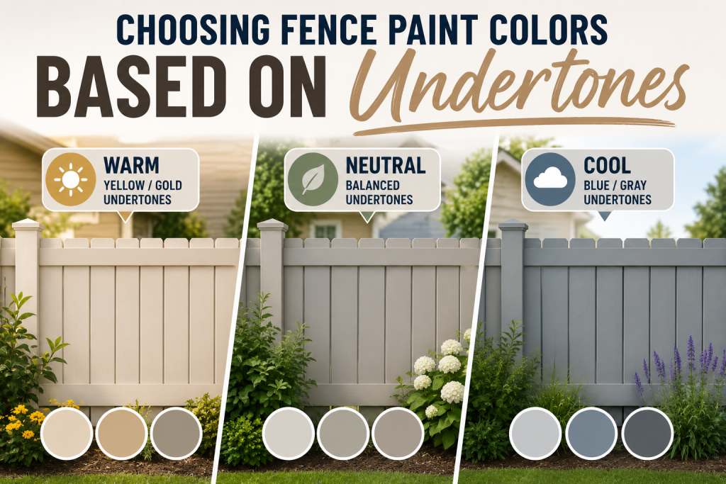
In open-concept layouts, consistency is key. Using colorless paint colors with balanced undertones helps maintain visual flow while still allowing slight variation between spaces. Without this balance, even subtle undertone shifts can create visual breaks that feel unintentional. It’s also important to match undertones with fixed materials like flooring, cabinetry, and countertops. These elements heavily influence how paint is perceived, especially in natural light, and should guide selection more than trends alone. Ultimately, successful wall color selection depends on how well undertones align with both the environment and the overall design intent of the home.
Final Thoughts
Mastering paint undertones is one of the most important steps in achieving a successful interior design result. While many homeowners focus on selecting a color they like visually, the undertone is what ultimately determines how that color behaves in real spaces. Whether you are working with warm undercolor for a softer, more inviting feel or cool undercolor for a cleaner, more modern look, the key is consistency and context. Undertones influence how walls interact with lighting, furniture, flooring, and even architectural details throughout the home. This is why colorless paint colors are often recommended for whole-home projects; they provide flexibility while still requiring careful attention to subtle undertone shifts. Without this understanding, even high-quality paint choices can feel mismatched once applied across multiple rooms. Using structured paint color matching ideas, testing with a reliable paint swatch lead, and evaluating colors in real lighting conditions all help reduce uncertainty and improve results. In the end, successful choosing fence paint colors is less about picking a shade from a chart and more about understanding how undertones shape mood, flow, and long-term design harmony across the entire home.
Frequently Asked Questions
What are paint undertones?
Paint undertones are the subtle underlying hues beneath a paint color’s surface. Even if a color looks like simple white, gray, or beige, it often carries hidden hints of yellow, blue, green, or red that affect how it appears on walls.
What is the difference between warm undercolor and cool undercolor?
Warm undercolor include hints of yellow, beige, or red and create a softer, more inviting feel. cool undercolor include blue, gray, or green, giving a cleaner and more modern appearance. These differences are key in choosing fence paint colors.
How do colorless paint colors behave in lighting?
Colorless paint colors can shift depending on lighting conditions. Natural daylight may reveal hidden undertones, while artificial lighting can make them appear warmer or cooler than expected.
What is a paint swatch lead?
A paint swatch lead is a method of testing paint samples in real environments, on walls and under different lighting to accurately evaluate how paint warm tones behave before committing to a full paint job.
What are the best paint color matching ideas?
The best paint color matching ideas include testing large samples, comparing colors in natural and artificial light, and checking how undertones interact with existing materials like flooring and furniture.