


Complete Guide to Choosing Paint Colors for Your Home
When it comes to choosing paint colors for your home, many homeowners focus only on aesthetics, but color decisions have a much deeper impact on how a space feels, functions, and even performs over time. The right color can make a room feel larger, brighter, and more inviting, while the wrong one can make it feel cramped or disconnected from the rest of the home. Paint color also plays a major role in setting mood and lifestyle expectations. Soft neutrals and warm tones often create calm, comfortable environments, while bold colors can add energy and personality. This is why home paint color ideas should always be tied to how each room is actually used, not just current trends.
Beyond design, color choice can also influence resale value. Many buyers respond strongly to cohesive, well-balanced interiors that follow a clear home color palette rather than random or overly personalized choices. In modern interior design, paint is not just decoration; it’s a foundational tool that shapes flow, perception, and long-term satisfaction throughout the entire home.
Understanding Interior Paint Option Basics
Successful choosing paint colors starts with understanding the fundamentals of interior paint options, especially how color, lighting, and finish work together in real homes. A paint color does not exist in isolation; it is always influenced by the environment around it. One of the most important factors is undertone. Even neutral colors like white, beige, or gray can have warm or cool undertones that change how they appear depending on natural light. A color that looks soft and balanced in a bright room may feel darker or cooler in a space with limited sunlight.
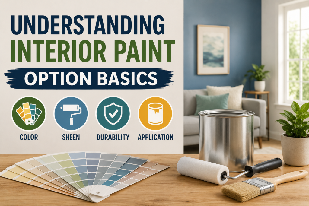
Lighting also plays a major role. North-facing rooms often appear cooler and may benefit from warmer wall color tones, while south-facing rooms tend to enhance warm tones naturally. Artificial lighting can further shift how colors are perceived throughout the day. Finish selection is another key part of interior paint selection. Matte finishes soften imperfections, while satin and eggshell provide more durability and light reflection. Understanding these basics helps homeowners avoid mismatched colors and build a more intentional, long-lasting color foundation for their home.
Choosing Paint Colors: Home Paint Color Thoughts
When choosing paint colors, it helps to start with versatile options that work across multiple design styles. Strong home paint color thoughts are usually flexible, timeless, and able to adapt as furniture, décor, and lighting change over time. Neutral palettes remain the most reliable foundation. Warm whites, soft greiges, and light beige tones are popular because they create a clean backdrop that works in modern, farmhouse, traditional, and contemporary homes. These shades also support better flow between rooms, especially in open layouts.
Soft earthy tones are another strong option. Colors like muted sage, clay beige, and dusty taupe add subtle personality without overwhelming the space. These tones are especially effective in living areas and bedrooms where comfort is a priority. Cool tones such as soft blues and gray-based neutrals can also work well in homes that receive strong natural light, helping balance brightness and create a calming atmosphere. The most effective wall color thoughts are those that feel intentional but not restrictive, giving homeowners freedom to evolve their interior design without needing frequent repainting.
Paint Color Mixtures That Create Balance
A key part of choosing paint colors is understanding how different shades work together throughout the home. Strong paint color combinations create balance, improve visual flow, and prevent rooms from feeling disconnected or overwhelming.
- One of the most common approaches is the neutral + accent system. This involves using a consistent neutral base, such as warm white, greige, or soft beige, paired with deeper accent tones in select rooms. This helps maintain cohesion while still allowing personality in spaces like dining rooms or bedrooms.
- Another effective strategy is using tonal layering. This means selecting multiple shades from the same color family, such as light gray, medium gray, and charcoal. This approach creates a subtle, sophisticated look that works well in modern interiors and supports a cohesive home color palette.
- Complementary contrasts can also be used more selectively. For example, pairing soft blue walls with warm wood tones or muted green accents can create visual interest without feeling chaotic.
When planned correctly, paint color mixtures enhance flow between rooms and make the entire home feel intentionally designed rather than randomly colored.
Building a whole house paint color scheme
Creating a whole house paint palette is one of the most effective strategies for simplifying choosing paint colors while ensuring the entire home feels cohesive and intentional. Instead of selecting colors room by room, homeowners build a connected system of tones that flow naturally from space to space. A strong palette usually starts with one primary neutral base. This could be a warm white, soft greige, or light beige that appears in multiple areas such as hallways, living rooms, and common spaces. This base sets the foundation for consistent home color schemes throughout the home.
From there, secondary colors are introduced for individual rooms. Bedrooms may use softer, more calming tones, while kitchens or living areas might include slightly warmer or more energetic shades. The key is maintaining harmony between undertones so transitions between rooms feel smooth. Accent colors are then used sparingly for visual interest, such as in dining rooms, powder rooms, or feature walls. A well-planned whole house paint color scheme reduces decision fatigue, improves resale appeal, and ensures that all interior paint option decisions work together as a unified design system.
Wall color thoughts for Modern Homes
When choosing paint colors, modern homes often prioritize simplicity, light balance, and long-term flexibility. The best wall color ideas are those that create a clean backdrop while still allowing texture, furniture, and natural materials to stand out. Neutral tones continue to dominate modern interiors. Warm whites, soft greiges, and light taupe shades are widely used because they create open, airy spaces that feel timeless and adaptable. These colors also work well across different lighting conditions, making them a safe foundation for most home color palettes.
Soft earthy tones are also gaining popularity. Muted sage, clay-inspired beige, and dusty mushroom shades bring subtle warmth without overwhelming the space. These colors work especially well in living rooms and bedrooms where comfort is a priority. For homeowners who prefer slightly cooler aesthetics, soft gray-based neutrals and muted blue tones can create a calm, balanced look, especially in homes with strong natural light. The most effective modern wall color thoughts focus on restraint and harmony, ensuring each room feels connected while still maintaining its own identity.
Creating a Practical Paint Color Lead
A strong paint color guide helps simplify the process of choosing paint colors by turning a complex decision into a structured plan. Instead of relying on impulse or isolated choices, homeowners can follow a step-by-step approach that ensures consistency and long-term satisfaction. The first step is identifying the purpose of each room. Bedrooms typically require calming tones, while living areas need more flexible home color ideas that support both daily living and entertaining. Kitchens and bathrooms often benefit from more durable, easy-to-clean finishes paired with well-balanced neutrals.
Next, it’s important to test colors in real conditions. Paint swatches should be observed at different times of day to understand how lighting affects tone and depth. This helps prevent mismatches caused by changing natural and artificial light. A practical guide also considers transitions between rooms. A consistent undertone across all spaces helps maintain smooth home color palette, even when using different shades or accent colors.mm. By following a structured paint color lead, homeowners reduce mistakes, improve visual flow, and make more confident long-term design decisions.
Common home color palette
Understanding home color palette is an essential step in choosing paint colors that feel balanced, intentional, and visually appealing throughout the home. Different color systems create different emotional and design effects, so selecting the right one helps guide the entire interior style. One of the most popular approaches is the monochromatic scheme. This uses different shades of the same color family, such as light gray, medium gray, and charcoal, to create a clean, cohesive look. It works especially well in modern interiors where subtle contrast is preferred.
Analogous schemes use colors that sit next to each other on the color wheel, such as blue, blue-green, and green. This approach creates a soft, natural flow that works well for calming wall color thoughts in bedrooms and living spaces. Complementary schemes use opposite colors on the color wheel, like blue and orange or green and red, but are typically used more subtly in modern homes to avoid visual overload. A well-planned paint color lead helps homeowners apply these systems effectively so each room feels connected while still maintaining its own identity.
Choosing Paint Colors Based on Real Home Conditions
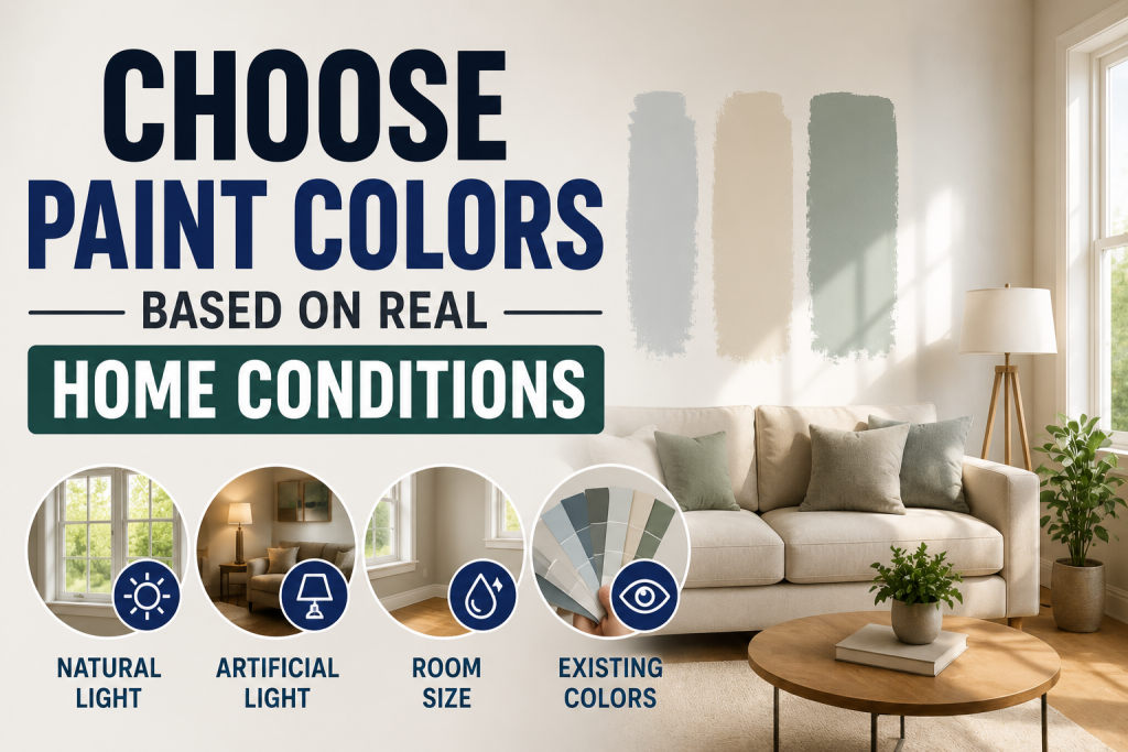
A practical approach to choosing paint colors goes beyond design trends and focuses on how a home actually functions in everyday life. Factors like lighting, room size, climate, and usage patterns all influence which colors will perform best over time.
Choosing Paint Colors: Natural Light Exposure in Each Room
Rooms with strong natural light can handle deeper or cooler tones more effectively, while darker spaces often benefit from lighter home paint color thoughts to prevent a closed-in feeling. Understanding light direction helps improve overall balance.
Room Size and Ceiling Height
Smaller rooms or low ceilings usually work best with lighter shades that open up the space visually. Larger rooms can support darker or more saturated tones without feeling overwhelming, especially when paired with a strong paint color lead strategy.
Home Climate and Regional Differences
Humidity, temperature swings, and sunlight intensity can all impact how colors appear. Homes in warmer regions often lean toward cooler palettes, while colder climates tend to favor warmer, more inviting tones in their home color palette.
Lifestyle and Daily Usage Patterns
High-traffic homes with kids or pets may prioritize durable finishes and practical tones that hide wear better. This makes interior paint options more about function than purely aesthetics.
Open Concept vs Closed Floor Plans
Open layouts require stronger coordination between rooms to maintain flow, while closed layouts allow more variation in paint color mixtures without visual conflict.
Common Mistakes to Avoid
Even with strong home paint color thoughts, many homeowners still run into avoidable issues when choosing paint colors for their home. These mistakes often lead to rooms feeling disconnected, outdated, or visually unbalanced.
- One of the biggest mistakes is ignoring lighting conditions. Natural and artificial light can dramatically change how a color appears, which is why skipping sample testing often results in unexpected outcomes. This directly impacts the success of any wall color thoughts selected.
- Another common issue is overusing trendy colors without considering long-term appeal. While bold or highly saturated tones can look appealing initially, they may not support a cohesive home color palette or resale value over time.
- Many homeowners also make the mistake of choosing colors room by room without an overall plan. Without a structured paint color lead, the home can feel fragmented instead of cohesive.
- Finally, mismatching undertones is a frequent problem in interior paint options.
Even neutral colors can clash if warm and cool tones are combined without intention, disrupting visual flow throughout the home.
Final Thoughts
Successful paint color selection is not just about picking attractive shades; it’s about creating a system that supports how a home feels, functions, and flows from room to room. When colors are chosen with intention, the entire interior becomes more cohesive and visually comfortable. A well-planned paint color lead helps homeowners avoid common mistakes like mismatched undertones, inconsistent lighting effects, or disconnected rooms. Instead of treating each space separately, a structured approach builds unity across all areas of the home.
Using thoughtful home color palette ensures that every room contributes to a balanced overall design, whether through subtle neutrals or carefully chosen accent tones. This improves both daily living experience and long-term resale appeal. Strong interior paint options also consider durability, lighting, and lifestyle needs, not just appearance. When all of these factors work together, the result is a home that feels intentional, functional, and visually timeless. In the end, smart color planning transforms paint from a simple finish into a foundational design tool that shapes the entire home experience.
Frequently Asked Questions
What is the best way of choosing paint colors?
The best approach to choosing paint colors is to start with a whole-home strategy, consider lighting conditions, and select a consistent undertone that works across all rooms. Testing samples in different lighting is also essential.
What are good home paint color thoughts?
Strong home paint color thoughts include warm whites, soft greiges, muted sage, and earthy neutrals. These shades work across multiple design styles and help maintain long-term flexibility.
How do I create paint color mixtures?
Effective paint color mixtures are created using neutral base tones paired with either complementary accents or shades from the same color family to maintain balance and flow.
What is a whole house paint color scheme?
Effective paint color mixtures are created using neutral base tones paired with either complementary accents or shades from the same color family to maintain balance and flow.
What are common home color palettes?
Popular home color palettes include monochromatic, analogous, and complementary systems, each offering different levels of contrast, harmony, and visual impact.